
What is concept art?
The purpose of Concept art is a form of illustration where the main goal is to convey a visual representation of a design, idea, and/or mood for use in films, video games, animation, or comic books before it is put into the final product. Concept art is also referred to as visual development and/or concept design. This term can also be applied to retail design, set design, fashion design and architectural design.
This information was found on Wikipedia.
Annotation of concept arts found On-line and done by myself.
Done by other artists.

This is Master Chief from the game Halo.
I like this piece because it looks like a traditional painting even though it is quite clear that it is digital. This is a picture of a character from the Halo franchise. This image has little attention to detail, but the messiness of the image creates the detail. I like their choice of dark colours and using the back ground colours in correlation with the foreground colours to slightly fade out other characters.
I like this piece because it looks like a traditional painting even though it is quite clear that it is digital. This is a picture of a character from the Halo franchise. This image has little attention to detail, but the messiness of the image creates the detail. I like their choice of dark colours and using the back ground colours in correlation with the foreground colours to slightly fade out other characters.

Image is found HERE.

This is the Skeleton for MineCraft I like this because the artist has kept some of the square dimensions that make this game what it is.
Done by myself.
Here is some MineCraft Fan-art that I have done myself.

This is a Pig from the game MineCraft.

This is a Creeper from the game MineCraft.
I did these in my spare time I just thought it would be nice to use examples of my own work as some fan art. Because the ones that I have already written about are a specific style, I wanted to put mine up too as a example of another style.

Sketch book work.

This is a flower that I started to draw in photoshop. .. The flowers I drew where fake. But I tried to do a realistic look. To have a photo realistic result.

Perspectives

These lines are perspective lines. We drew the image first and then added the lines.. The lines seemed pretty in line already.. So I was pretty chuffed with that.. I shaded the image after so that it didn't look so flat.

Here is the original image.
Environment Design.


This is the thumbnails that I drew based on the research I did on the artists Gerhard Mozsi's work. I drew them very vague because I didn't want my work to be TOO similar. I wanted to remember the very vague sketches I did and to create a piece with my own adaptation to it.
This is my final image that I completed on Photoshop based on the artists research and thumbnail images. I like the little detail in this image because it reminds me of the Master chief-Halo image that I annotated.
 This is my final design after improvement, using feedback from someone I took to note their criticisms and used them to improve this piece. I made the energy warp coming from the portal more subtle and blurred, I also added subtle little light orbs because it makes it look more magical and whimsical, I prefer this more because this seems more realistic.. even if the style of this is suppose to be scratchy and sketched.

Character Design.
I also have sketch work that I'm still working on getting onto here.
 The artist who inspired my character design is Mathias Verhasselt.
This image is the main inspiration of my work.

This was also a huge influence on my character. I used the long hood idea to make the head of my Character long and dangle like a Christmas hat.

 This is thumbnail images that I drew of different pieces of this artists work to build ideas with. This inspired me HIGHLY on the look that my character will feature.
 This is the final image that I created using the thumbnails. The image on the right is a suggestion Rob drew in my book. But I thought it looked too generic and kept my own idea.
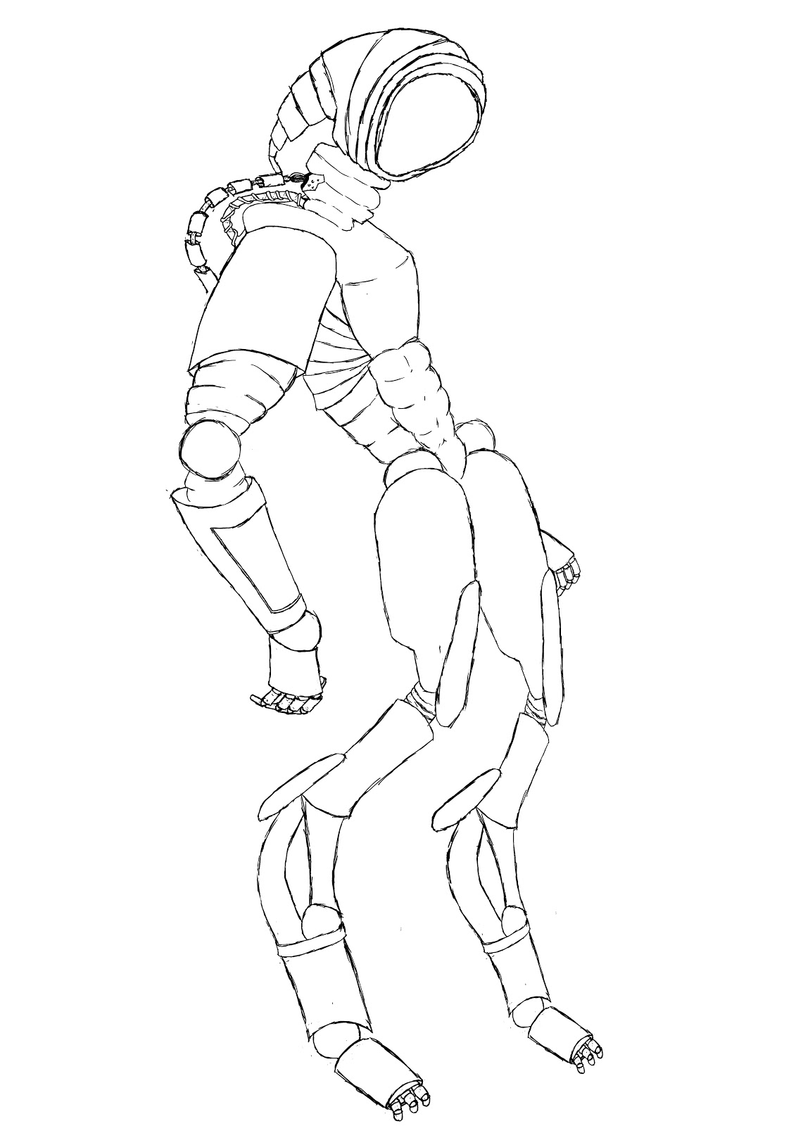
This is the final out-line of my character based on images done by this artist. As you see I've kept the shape of the body. It will be dark and mysterious like the second artists image that I collected.

This is my final piece, I added colour to it so that it was presentable in my work development sheet. I like this because it looks simplistic.
I lie the line work in this because I spent time on it so that it was clear as to where the lines are.. there are no real dark spots that hide away the lineage.

Over all this is my final design, after working with the line work I added colour to it but it seemed that the colour was too bold and blocky. I added a texture to the metal work that I made myself using the gradient and the noise tool in Photoshop.. I also wanted to create some light from the characters face so I added glow and reflection. I am finally pleased with the results of this final piece.
The difference between the two final pieces is that I have added much more detail in the second.. I have also taken the time to slightly texture it all, including the character's face. I also added some artistic character to the back ground to show some depth of field, before it just looked as if the character was just floating and it looked very wrong. I like the reflection in the second image, it makes the characters look more 3D and it also makes the abs and muscular details "pop out" more.
I also created a metal grain with this image but I used the liquify tool to make the grain rounder in areas so that it looked like it was flowing with the shape of the material that the character has on it's body. I also added a lot more glow to the pipes leading to it's head, because the aim of it was suppose to have the glowing-green liquid in these pipes.. but this was not very evident as I did not really add enough green colour.
Object design.

Here are some gun things that I have drawn using ideas from the web-site. PimpMyGun.
I think these were some what similar to my final.

Here is the image that I created on Pimp My Gun.

Here is my final gun design. I'd chosen gun as my object to draw because I was getting into drawing them in the lesson and wanted to carry on making gun designs.


This is the work development sheet that I did for my Gun/object work.